


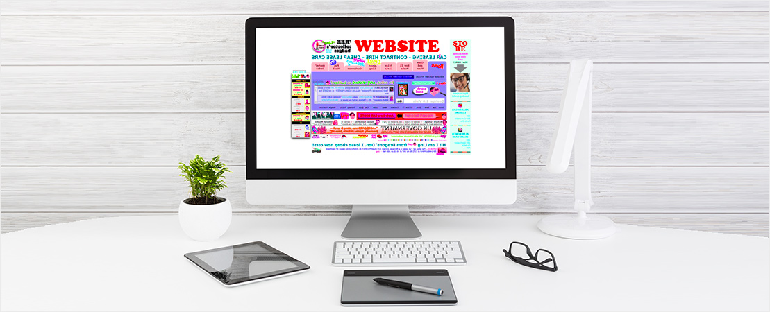
There’s Too Much Happening on Your Website
Getting your first Website is exciting! But sometimes this excitement can lead to a desire to cram it full of every Design element available, just because you can’t pick your favorite! But hold up there a second, Cowboy. This surge of enthusiasm will probably do you much more harm than good.
Overcrowded Websites jammed with text and overflowing with images will be unappealing to your potential customers. Imagine walking into a store so packed with shelves and racks of items that you feel completely overwhelmed. You’d probably leave after a minute or so, if not sooner. And, an overcrowded Website can have exactly the same effect.
The other consequence of a Website which has been overly designed, is that it will likely take much longer to load. With consumers so used to having the information they want within a second, if your Site has slow load times this could see a serious decrease in visitors. Search Engine also penalise Website’s with slower loading times, which could result in your Business being bumped down in the Search results.
When first considering the Design and layout of your new Website, think about the Design elements which are most important. Which ones really tell the story of your Business and convey your branding and message. These are the features you need to put on your Site, everything else will probably just be overkill.

There’s Not Enough Happening on Your Website
While having too many Design elements crammed onto your Website isn’t recommended, having too little can be just as detrimental, especially if visitors are left scratching their heads wondering where they can buy your products or find the information they need.
While a simple, minimalistic Site is fine if it reflects your Brand, you still need to be aware of giving your customers everything they require. You can’t provide little bits of information and leave it up to your visitor’s imagination, they simply don’t have time for that and will jump over to a competitor’s Site without any hesitation.
So, even though minimalistic design is a popular trend in Web Design at present, make sure you use it wisely. Ensure you follow all the typical navigation protocols, include all the information someone might need to buy from you, and make it easily accessible to your visitor. The last thing you want to do is leave them scratching their heads!

Your Call-to-Actions Are All Wrong
Your Call-to-Action buttons, might not seem incredibly important when first creating your Website, but could actually help to significantly influence your Site visitors to take action.
A Call-to-Action, or CTA as they’re otherwise known, is the Marketing term used to describe the buttons you see on Website asking you to “Click Here”, “Buy Now!”, or “Sign Up for Free”. These buttons direct your Site visitors to take your desired action, and should be designed in such a way that they are enticing and persuasive to viewers.
Confusing, misplaced or a lack of CTAs could spell disaster for your Site. If the button suggests one thing and delivers another, you’re immediately creating mistrust between the customer and your brand. And if you don’t have enough on your Site, visitors will be left scratching their heads as to where they can take action; whether that be to make a purchase, sign up for your newsletter or download a resource.
Your CTAs should be eye-catching, clear about the action you want carried out and should make the user excited for what’s going to happen if they click. Before they click on the button, they want to know what they’re going to get. So better stop beating around the bush and tell them exactly what you have to offer!

Fancy, Finicky Fonts
Your copy makes up 90% of your Website’s content, so make sure people are able to read it. While pretty, cursive fonts may be appealing to you, and may even complement your brand, they can be difficult to interpret. Especially for those reading on mobile devices with smaller screens.
Remember that your copy is laid out on your Website for the purpose of informing readers about your products and services. Make sure it’s as understandable, clear and easy to digest. This also means ensuring that the colours you choose don’t hinder the user’s ability to read the text. Some colour combinations, such as yellow text on a white background, are notoriously tricky to read, so avoid them at all costs.

Irrelevant or Low-Quality Graphics
Great images or graphics on your Website can be invaluable for your Small Business’s Online success. But be warned, low-quality or irrelevant images or graphics can seriously hinder, not only your branding, but also negatively affect the user experience of your Site.
When it comes to Online, everything is taken at face value. So if you use poor-quality images, photos or graphics on your Site, people will immediately associate your Business as being low-quality, or even “cheap”.
Graphics should be used as a way to enhance your users’ experience on your Site. They should help your visitors understand things that can’t be so clearly explained through text. By providing them with clear, high-quality imagery, you’ll be giving yourself the best chance of converting that potential customer into a sale.
Whether you’re just about to create a Website, or redesigning an existing Website, you should keep all these things in mind. Always keep your Website visitors are the forefront of your mind when designing your Business’s Site, as this will allow you to create the very best experience for them. And, after all, that’s what it’s all about! Presenting your visitors with a beautifully designed, clear and easy to use Website that delivers everything they need!