


Simplification
In an increasingly cluttered world, it seems that people are now beginning to crave some kind of peaceful minimalism amongst the materialistic rubble of our modern society. 2017 has undoubtedly been the renaissance of ‘The Simple’, with everyone from the biggest fish in the pond to sole traders opting for refreshingly clean and straightforward logo designs.
Perhaps the best example of logo simplification came from Italian soccer giants Juventus, who ditched their classic yet cluttered shield for a simple two-tone design that saw the ‘J’ in Juventus double up as a replica of the club’s infamous black and white stripes.
Similarly, look at Apple’s simple, omnipresent design. Found on the back of MacBooks and iPhones everywhere, simplicity permeates every facet of their design process, from logo to finished product.
In terms of Small Business success, simpler logos tend to be more easily scalable, meaning you needn’t spend mega bucks getting your logo redesigned or resized when your consider launching on the next big platform.
Letter Stacking
Put simply, letter stacking is the technique of rearranging the letters and wording from your Business or tagline so that they are presented above, underneath or alongside each other. This was a logo design technique utilized by everyone from fashion chain stores, right through to Health and Wellness Giants in 2017.
The result of this technique is a presentation of your text in a configuration that looks like it would fit into a clean square. Once again, neat, simple and tidy. Are you noticing a theme here? A key advantage of letter stacking is that gives those who don’t have a particularly strong association with a particular image or symbol the chance to turn the actual name for their Business into the logo itself.
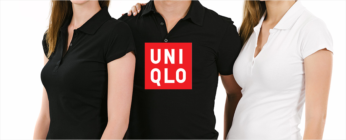
For instance, the apparel retailer UNIQLO uses a simple stacking of their letters on a red background as their logo for all promotional material and clothing. Doing this allows the brand to retain a stripped-back, uncomplicated feel, which fits perfectly with their store and clothing branding.
Besides negating the need to include an image or symbol in a logo to create a pleasing aesthetic, letter stacking is also useful for those who wish to have their name take pride of place. This technique allows your Business’s name to become the central element and the first thing consumers will associate with your brand.
Finally, stacking in unusual ways can give the consumer something to think about as they try to unravel exactly what it is they are reading. Such a technique can generate continued interest, but this should always be carefully balanced with the need to actually convey a brand name. Letter stacking can work perfectly when properly executed but use it carefully. If not implemented effectively, your viewers can be left wondering what the letters exactly spell out!
Hand Drawn
Logos in a hand drawn design also provide escape from the pitfalls of overdesign in 2017, but did so through a play on the idea of a rejection of technology. By opting for a hand drawn style, you guarantee you won’t be embarrassed at your next trade fair when your competitor turns up with a logo in the same font as yours.
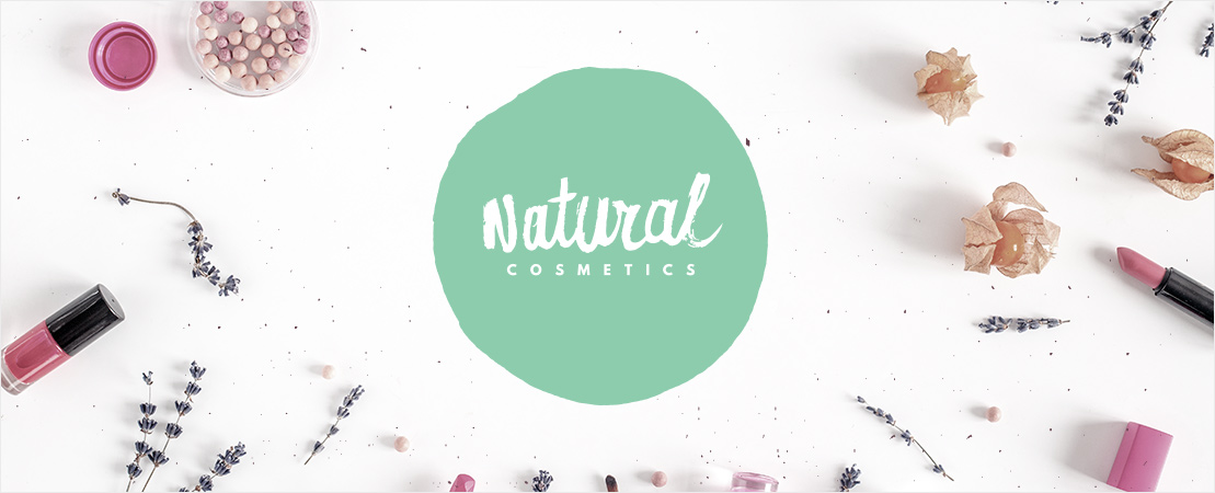
This more natural design technique offers you the chance to distinguish yourself nicely from your competitors if you’re in a field where a lot of geometric or busy styles are used. Besides this differentiation, hand drawn logos can resonate really well for any Business where a ‘back-to-basics’ or unpretentious approach is key to you brand message. For example, a Small Business operating in health foods or organic produce could use a hand drawn logo in order to convey a message of being wholesome, pure and natural.
Besides this promotion of a simple, untouched message, hand drawn logos often carry a slice of personality that it’s hard to capture in overly computerized designs. Maintaining a hand drawn logo can help your Business maintain that personal feel that so many organizations lose as they grow rapidly.

Know Your Market
While an appreciation of the previous year’s trends is a useful guide for anyone looking to create or update their logo, the fact that trends are, by nature, constantly evolving should always be considered.
Rather than basing your choice on 2017’s highlights, try to have a wider think about what exactly will fit your market and Business. Where possible your logo should fit seamlessly into the central message of your Business, and if this means trying something that doesn’t fall under any of these three categories, that’s okay!
Similarly, have a think about what your customers want from a Business like yours and try to incorporate that into your logo. If you offer medical services, you’ll want your logo to appear a professional and belonging to a trustworthy Business. If you own a children’s clothing brand, you’ll want your logo design to be bright, colorful and full of life – like the children you’re supplying clothing to!
Keep your audience in mind and choose a designer who is open to working with you to help customise a logo that best reflects your Business and personal Brand. After all, no one knows your Business like you do!