


Create a Winning Homepage
Your Website’s Homepage is where most of your potential customers will land, so it needs to be, well, perfect. No pressure.
Even if this is not the first time someone is visiting your Website, you need to make sure that you make a good first impression, and quickly. These days, people are so used to getting what they want at the click of a button that if they see something confusing, complicated or unappealing on your Website, they’ll leave straight away.
Here are few things to keep in mind while crafting your homepage:
- Keep it short and simple: make sure your content makes sense, reflects your Business and isn’t overly technical.
- The most essential content in homepage must be placed above the fold: this ensures that even if someone skim reads your content, they’ll see the most important information first.
- Every other page in your website should be connected with the homepage: make sure your homepage is accessible from every point in your Website.
- Link your logo to your homepage: this keeps your branding strong and let’s your visitor know they’re in the right place!
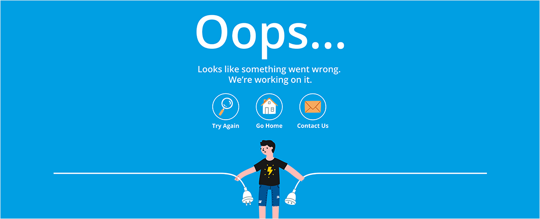
Do 404s The Right Way
Every Online user will have, at some stage, been faced with an Error 404 page. Now, while this isn’t the end of the world, these pages can result in people bouncing quickly off your Site, or else having no clear direction of where to go next.
There is a way however, to make 404s work for your Website. Instead of simply having a blank page with the traditional 404 error message, create a more appealing page, with visuals and perhaps some quirky, amusing text that will endear your viewer to your Business. This can, in fact, actually assist with your branding efforts!
It’s also highly important to include links to other pages on your Site that may be of use to your visitor. This will help guide them back into the clear, so they can keep browsing your Site and find what they’re looking for.
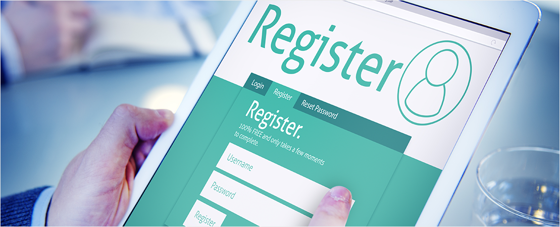
Keep Your Forms Simple
If there’s one thing that most people hate doing, it’s filling out long, boring and unnecessary forms. You hate doing it in the real-world, so why would you make your visitors – who are likely to have even less time! – do it on your Website?
If forms are necessary on your Site, for example if you own an E-commerce Store, then try and make them as simple, straightforward and short as possible, as it’s typically the time of the purchasing process when you’re most likely to lose a customer. If faced with a set of 20 seemingly unimportant or overly complex questions, or if your form simply doesn’t make sense, that’s a lost customer right there.
When it comes to creating a completely user-friendly form that will maximize your conversions, keep it short, ensure only the essential questions are included and make each step as simple as possible.

Slow and Steady Doesn’t Always Win the Race
In today’s Digital Day and Age, the vast majority of the population are used to having access to everything at high speed. For this reason, it’s absolutely vital that you make sure your Site’s load times are, err, up to speed.
Most web visitors will expect a Website to load within three to four seconds, whether that be on a desktop or mobile device. If your Website loading time is more than that, they’ll likely get bored and simply jump over to a competitor’s Site. In fact, a study conducted by radware revealed that even a 2-second delay in load time during a visit resulted in abandonment rates of up to 87%.
Remember, at this stage of their journey, the visitor doesn’t owe you anything – they don’t even know you yet! So think of this as the equivalent of arriving late to a first date, which is never a good look.
There are several Website speed-testing tools you can use to gauge your Site’s performance. If it’s taking too long, then you probably need to consider the elements that are slowing it down. This could include anything from videos to images that are too large.

The Detail is in The Device
Responsiveness is a crucial part of creating a great user experience. With so many people now using Mobile devices, such as iPhones and Tablets to browse, search and shop Online, if you’re Site isn’t Mobile Responsive you’ll be alienating a large proportion of your audience.
We’ve all seen them – those Websites that aren’t responsive. You’re searching on your mobile and click on the link and all you can see is a weirdly shaped screen with the text overlapping. When faced with a Site like this, your potential customers will have very little patience and will leave. Straight away. Not only this, but they are also unlikely to return, knowing that if they’re using a Mobile device they won’t be able to view your Site correctly.
So don’t get caught out. Make sure your Site works on everything from Desktop to Smart Phones and everything in between! And ensure you test the User Experience on each, so you know exactly what your customers are seeing.

Add Persuasive Call to Actions
Easy to understand and persuasive Call-to-Actions (CTAs) can work wonders for boosting your Online conversions. Not only do they give your Site visitors very clear instructions on what to do next, the right CTA can be the one little difference between a sale and a missed opportunity.
There are many Websites without clear Call-to-Actions that leave a visitor without any clue what action they should take on the Site. A clear CTA button, labelled “Buy Now”, “Register Here” or “Sign Up Today!” will clearly tell your visitor exactly which action they should perform next.
Think of these CTAs as breadcrumbs that you leave, allowing them to make an easy-to-navigate journey through your Website. Not only will this make the whole process incredibly easy and seamless for them (which they’ll be very thankful for), it’ll also help to increase your sales!
With these small and simple tips in mind it’s time to go forth and optimize your Website so as to give your visitors the best possible User Experience. Not only will this serve to build a strong reputation for your Business and boost conversions, but will also likely result in repeat buyers!